

~Article by Danie Bester
At DPC we started our first Portrait Mentorship Programme this year, and we have covered a lot of ground. Business portraiture to begin with. Then character portraiture, then beauty, and we have just come out the other side of fine art portraiture. It has gone well. Better than I expected in a few places.
Editorial portrait photography is up in a few months, and it builds towards one of the highlights of the programme: the group’s own editorial fashion shoot.
This piece began as one of the tutorials for that section. I decided to put it out publicly instead, because what it is really about applies to every portrait you will ever make, not just editorial ones.
Here is the definition for Portrait Photography I teach in our Basic Photography Course. I wrote it years ago and I have not yet found a reason to change it.
Portrait photography is the art of capturing someone’s personality, character, or features by using light, background, colour, composition, pose, and expression.
— Danie Bester
I keep coming back to it because it holds the entire process in one sentence. Whichever kind of portrait you are making, you are after personality, character or features. Beauty and fashion lean towards features. Editorial and character work lean towards personality. And you get there using the same six things every time. Light. Background. Colour. Composition. Pose. Expression.
Six elements, and the picture is made by how they combine. That is the part I want to talk about here, and Annie Leibovitz’s 2016 Vogue editorial with Adele is one of the clearest examples I know.
A strong portrait is not built by one impressive trick. It is made when light, background, colour, composition, pose and expression all pull in the same direction.
The problem with trying too hard
Here is what I keep seeing, and not only in beginners. Photographers with genuinely excellent lighting skills. Clean, controlled, beautiful light. Careful, restrained retouching. Backgrounds chosen properly. Posing that works.
And they are working so hard to make the picture work — one more light, one more prop, one more idea, one more effect — that they never arrive anywhere near a quiet portrait. A calm, contemplative photograph of a person is one of the hardest things in our craft, precisely because there is nothing to hide behind. No trick is carrying it. Either the combination holds together or it does not.
That is what I admire most in Annie Leibovitz, and it is not the access or the production budget. It is visual intelligence. She knows what each element is for, she knows which one is carrying a given photograph, and she knows when to stop adding.
In March 2016 she photographed Adele for the cover of Vogue and the editorial that ran with it, Adele in Spring’s Fabulous Frocks. It was made at Claridge’s in London: grand pianos, deep red walls, old paintings in gold frames, worn carpets and a green damask sofa.
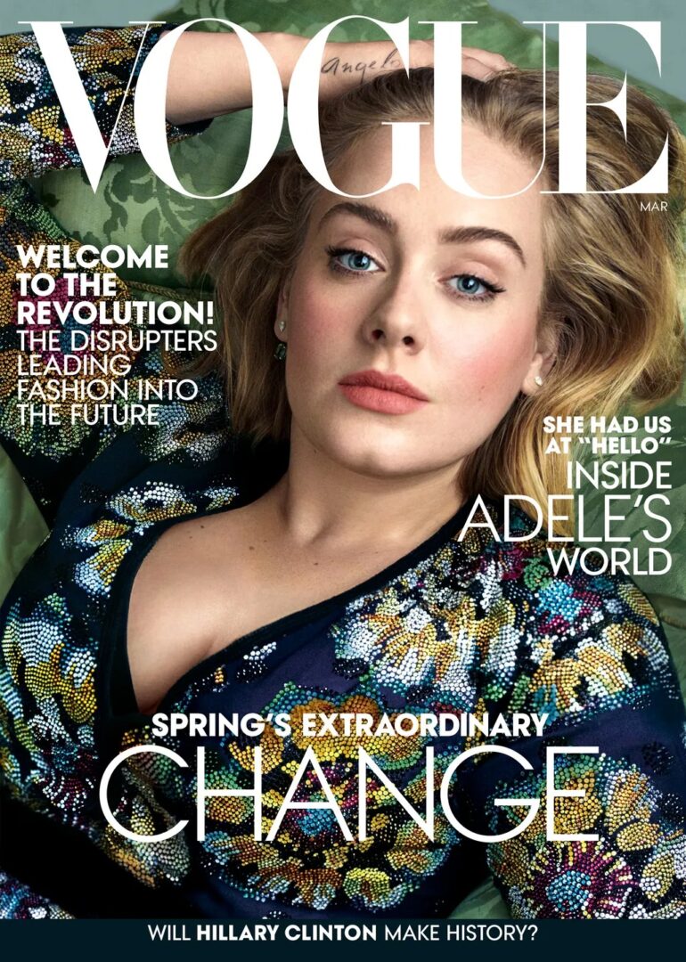
It is a fashion editorial, so the frocks are part of the job. But look at the full set and notice who is still in charge. Adele never turns into a clothes hanger. The rooms and the dresses stay one step behind her.
So, before we get anywhere near lighting or styling, spend some time simply looking.
A strong editorial is not a pile of nice portraits that happen to share a model. It is a set built around one clear idea. Every frame must give you something the others don’t, while the whole thing still holds together. That is harder than it sounds, and the quickest way to learn it is to study somebody who has already managed it.
Look past the questions we usually reach for first. Focal lengths and modifier sizes will teach you very little here. Ask instead:
- Why this room and not another one?
- What does the setting tell us about Adele?
- Why is this photograph tight when the next one shows the whole room?
- What is her body doing — the neck, the shoulders, the hands?
- What does each photograph add that the others do not?
Background: the rooms are doing work
Leibovitz did not simply find seven attractive backdrops.
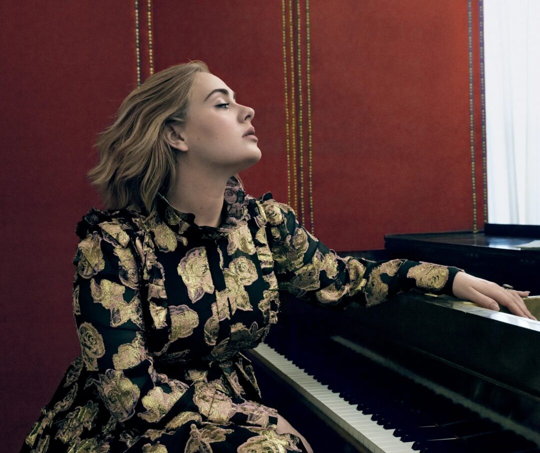
The piano is the obvious choice, and the right one. Adele writes songs and sits at pianos, so it is not a prop, it belongs to her. Here we get a sliver of black and the edge of a keyboard. Plenty.
But notice what the piano is really doing in this photograph. It gives her somewhere to be, something to lean on, a reason to lift her chin and close her eyes. Put her against a plain grey background in the same dress and you would not get that head position, and without that head position you have very little.
That is the part worth holding on to. The background is not decoration. It is one of the six, and it works on the pose and the expression rather than sitting politely behind them.
The rooms themselves are grand but slightly tired: faded carpet, marked walls, furniture that has been sat on for a century. Success and history with the shine worn off. That suits her far better than a spotless set ever would.
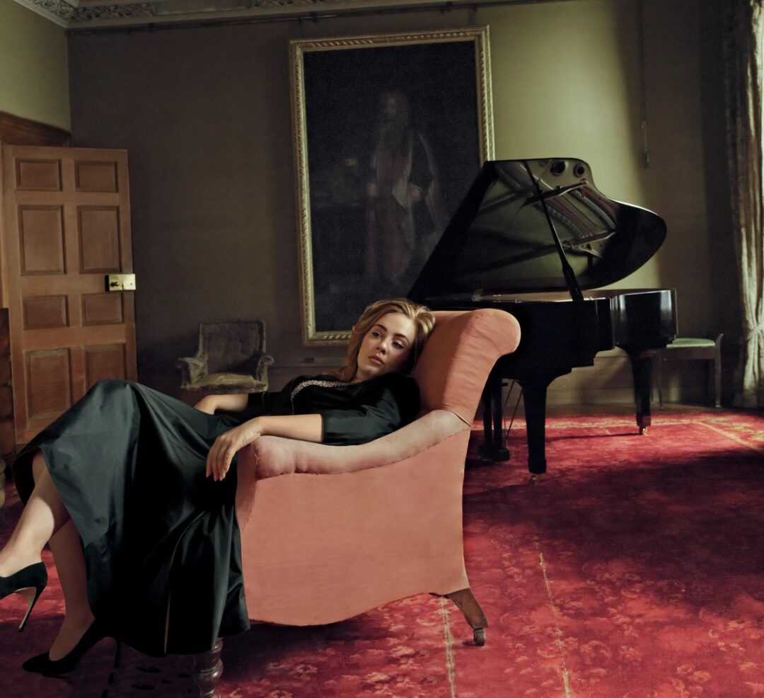
Now here is the thing I most want you to take from this section. She does not blur any of it away. The carpet, the painting, the panelling and the piano all stay readable. That is a decision, and it runs against the reflex most of us have, which is to open the aperture as wide as it goes and melt everything behind the subject into a smooth wash.
A blurred background may put all the attention on the subject, but it often tells us little about the person. A chosen background does something different: it gives the portrait context, supports the pose, and helps explain who we are looking at. If the room is part of the story, do not blur it away. Let us see it.
A blurred background may isolate the subject, but a carefully chosen background can help tell us who the person is.
She could have moved in and made a lovely head-and-shoulders here. Instead she stood back and let the room speak. Adele looks calm, and also quite alone.
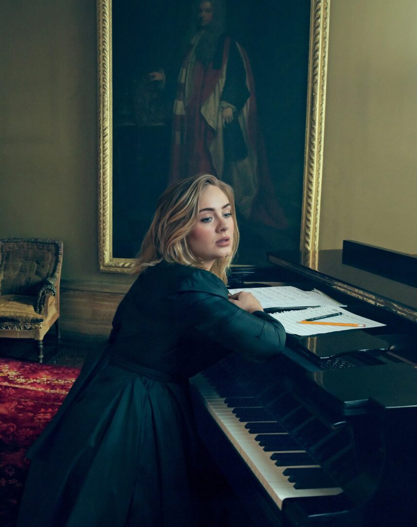
This one ties the setting to the person: manuscript paper, a pencil, a piano being used rather than posed against. Give somebody a real task and then interrupt it, and you get the turn of the body you see here. That is a directing technique, not an accident.
I am not going to turn every object into a symbol. The pencil is a pencil. But the choices add up.
Colour and composition: what holds the set together
Notice the colours. The reds keep returning, along with the golds, the greens and that warm old wood. It is a large part of why seven photographs feel like one piece of work rather than seven separate shoots. Colour is in the definition for a reason — it is doing structural work here, not just looking nice.
This was a team, of course — Tonne Goodman styled it, Mary Howard designed the sets. Every choice still served Adele.
Then there is the framing, and here is the most useful practical lesson in the whole set.
They shot in one hotel, and you have already seen the piano three times without seeing the same photograph twice. A tight profile. A wide frame with the chair, the carpet and the painting. A shoulder turned back towards us with music in front of her.
Then the same building gives us this.
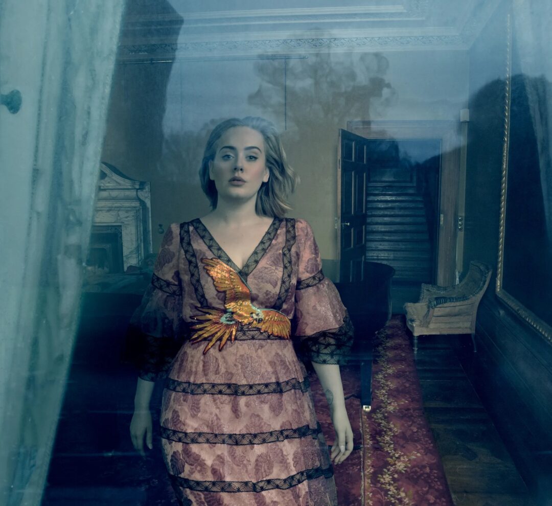
We are outside now, looking in, and not particularly invited. Different mood entirely, same hotel.
The sofa does it too.
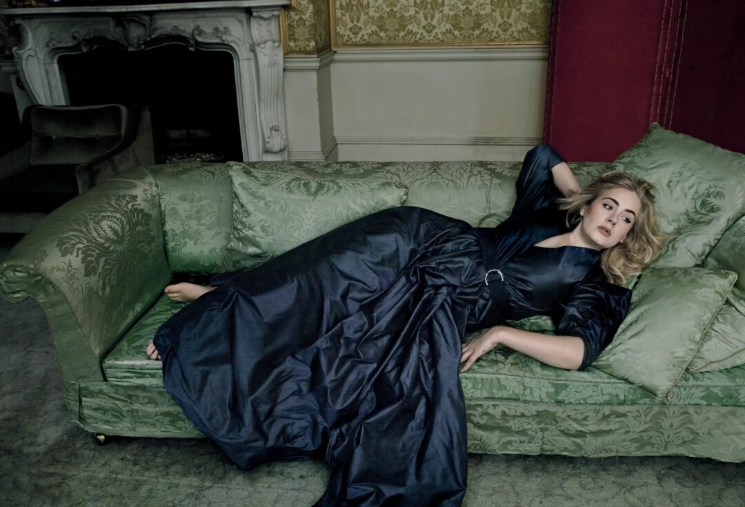
Compare that with the cover at the top. Identical sofa. There she is close, upright, looking straight down the barrel at us. Here she is stretched out, turned away, small inside a big frame.
The furniture didn’t change. What changed was the framing and the pose. That is the whole lesson.
Remember it the next time you are planning a shoot. You do not need six unrelated sets. One good room, worked properly, will give you more than six mediocre ones.
Light: it is not trying to impress you
I cannot tell you exactly how these were lit, and neither can anyone who was not standing there.
What I can tell you is what they look like. Leibovitz is well known for using broad, soft sources, and these photographs have that feeling: a large modifier, a big window, or something equally soft, with just enough fill to keep the shadows open. The real setup may well have been more involved. Claridge’s, a Vogue crew, Annie Leibovitz — I would not bet on simple. But the lighting is not pretentious or overwhelming. It does not look complicated, and that is the trick.
The light lands on Adele, wraps a little, then falls away into the room. Shadows are allowed to stay. Her skin still has texture. Nothing has been polished until the life has gone out of it. No clever rim light shouting for attention. No five-light setup asking to be admired.
There is a reason for that restraint. In this set, the light is not the star turn. It is the element that lets the other five be seen. The moment the lighting starts overperforming, everything else has to compete with it.
The light should serve the portrait, not ask to be admired. The moment the lighting starts overperforming, everything else has to compete with it.
So here is the line worth taking away: do not let your setup become proof of how clever you are with lighting. Photograph the person.
Pose and expression: the last two, and the quietest
Now go back through the previous photographs and look only at her face.
Here is what you will find, and it surprised me the first time I did it properly. The expressions are not that different. There is no big smile, no theatrical sadness, nothing you could point at and call a performance. She sits somewhere between calm and thinking in nearly every frame. The register barely moves.
So why does each photograph feel like a different photograph?
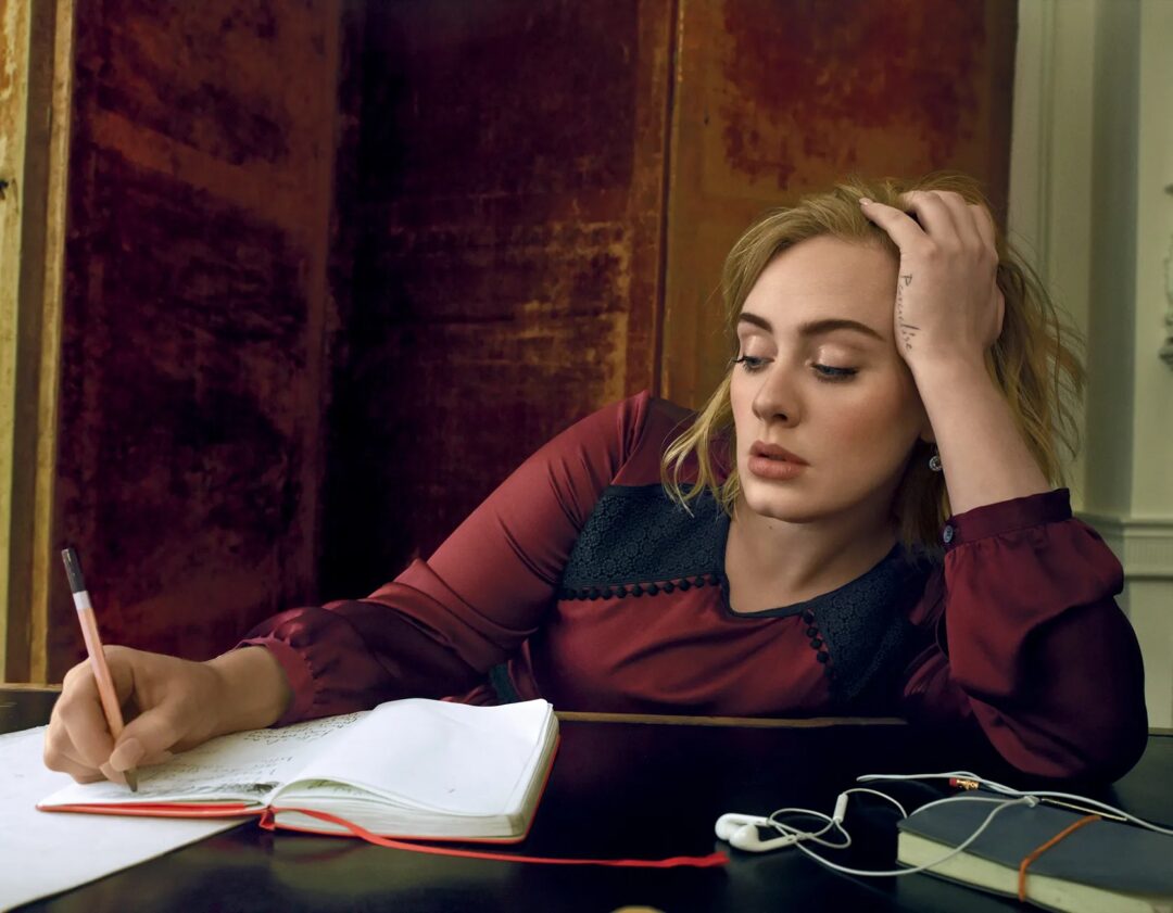
Because expression is never only the face. It is the tilt of the neck. Where the eyes go. What the shoulders are doing. Whether the hands are busy or resting. And it is everything around all of that — the room, the framing, the light.
Chin lifted and eyes closed at the piano, and it reads as absorbed. That same quiet face turned back over the shoulder with music in front of her, and it reads as interrupted. Lying back on the sofa with the eyes drifting off to the side, and it reads as unguarded. Straight down the barrel on the cover, and it reads as steady and entirely in charge.
One woman, roughly one expression, made to mean four different things by pose, framing and background.
This is exactly why expression sits last in the definition. It is the final culmination of a portrait, and everything else is preparation for it — but that cuts both ways, and the second half is the part we usually miss. You do not get the expression by concentrating on the expression. You get it from the room you chose, the light you put her in, where you asked her to sit, and what you gave her to hold.
Expression is the culmination of the portrait. You do not get it by staring only at the face; you get it from the room, the light, the pose, the framing and the direction.
Get the other five wrong and no expression will rescue the picture. Get them right and a small movement of the head is enough.
Watch her hands while you are at it. Fingers pushed into the hair, an arm draped over the back of a chair, a hand resting on the keys, a pencil held over a notebook. Hands and face work together. When the hands have a job, the face stops trying.
I want to be careful here. Absorbed, interrupted, unguarded — those are things the photographs suggest, not facts about what Adele was feeling that day. None of us were in the room. And none of it was necessarily relaxed either. There would have been a crew, a schedule, heavy clothing and a great deal of pressure. Photographs that look effortless are usually the result of patience, clear direction and a lot of frames.
A shoot does not have to feel effortless for the photograph to look effortless. Making that happen is our job, not the subject’s.
Back to your own portraits
Leibovitz has more technical ability than she needs here, and that is precisely why these work. She keeps it out of the way. What we are left with is the contemplation, the strength and the elegance of this woman as she saw her.
The goal was never simply to make Adele look beautiful. Plenty of photographers manage that. It was to make us feel we had seen something of the person behind the famous face — and she got there by putting six ordinary elements in the right relationship to each other, then leaving them alone.
That is what I want the mentorship group aiming at when we shoot our own editorial, and it is what I would want for your next portrait too. Not proof that you can light. Not proof that you can retouch. A set of photographs that hold together, with somebody real at the centre of them.
Do not make a portrait that proves how clever you are. Make one that leaves somebody real at the centre of it.
Have a proper look at the full editorial, slowly: Adele in Spring’s Fabulous Frocks, Vogue, March 2016
Then pull up your own recent portraits and run them past the definition. Light. Background. Colour. Composition. Pose. Expression. Which of the six were you actually thinking about when you pressed the shutter, and which ones simply happened to you?
That question has improved more portraits for me than any piece of equipment I have ever bought.
Photography: Annie Leibovitz. Fashion editor: Tonne Goodman. Set design: Mary Howard. Hair: Shay Ashual. Make-up: Mark Carrasquillo. Vogue, March 2016.
The definition of Portrait Photography in this article is the one we work from in the Basic Photography Course at DPC | Digital Photography Courses. The Portrait Mentorship Programme takes it further, one portrait category at a time — business, character, beauty, fine art, editorial — with real shoots and honest critique.

A powerful dissection of what makes the work of an all-time great like Annie Leibovitz stand out.
One of the biggest things I’m learning through the mentorship is to stop trying so hard to make a technically “good” photograph, and rather think about what the photograph is actually trying to say.
Light, background, colour, composition, pose and expression… simple enough on paper, but making them all work together with intention is a completely different story.
“When the hands have a job, the face stops trying.” Definitely taking that one with me!
Great article, Danie.
Very interesting article on the way you see Annie’s shoot with Adele. what stands out for me in this series is the way it is edited. Everything works together, the background, colour, pose, expression, etc., but the editing is done in such a way that Adele looks like a painting that came to life. At least, that is how I see it.
The mentorship program really dropped me in the deep end, but I have learned a lot from it so far and hope to learn so much more. What I have learned so far is that you don’t always need elaborate lighting setups or costumes. The right pose and expression can really improve an ordinary photo.
Great article and thank you for all your hard work on this mentorship program Danie.